
SEE All WORKS
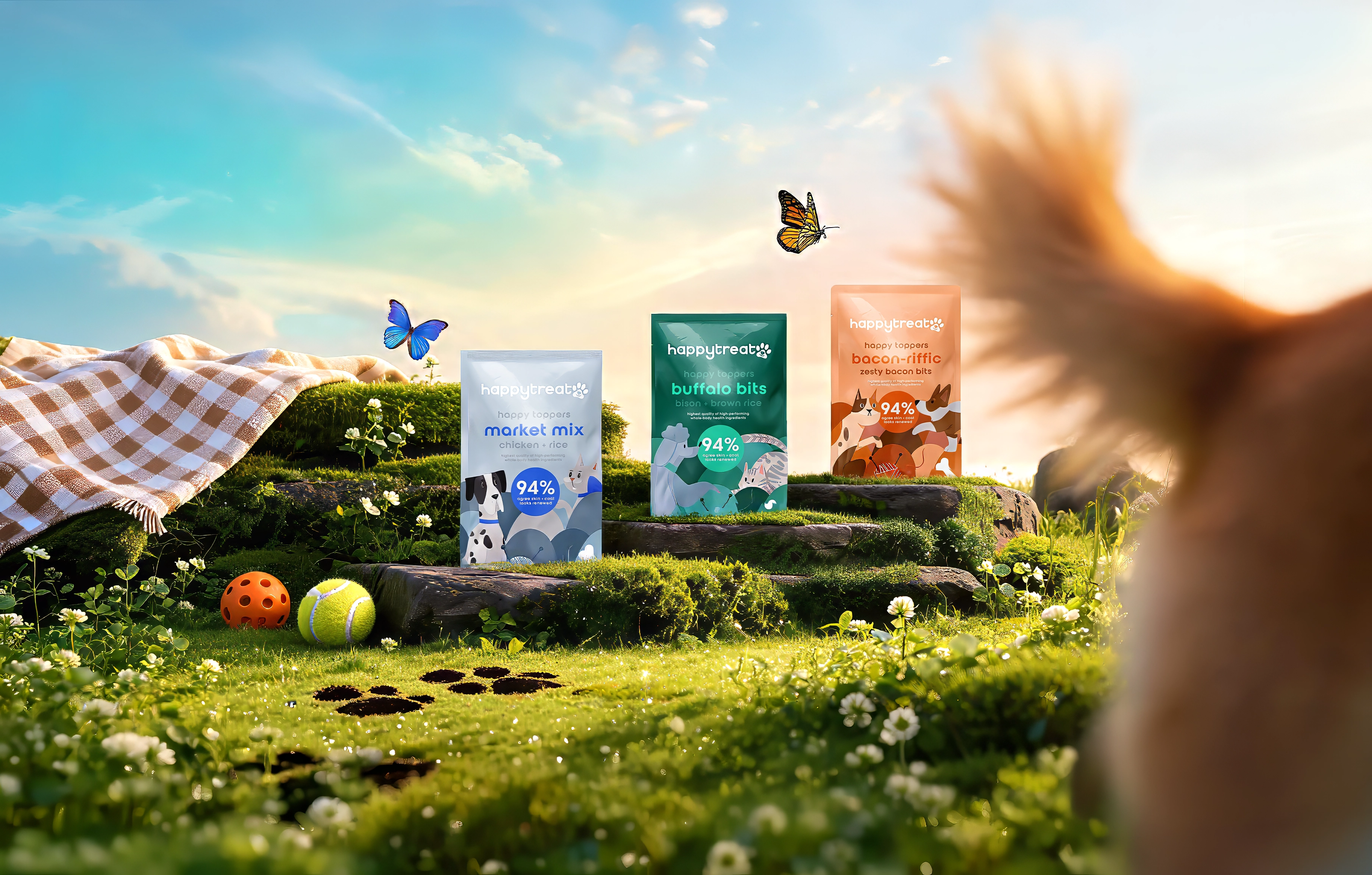
Happy Treat
Every bag of dog treats promises the same thing off the same shelf. Happy Treat had zero history and one shot to make someone's hand skip the brand they already trust — so I built the logo, identity, and packaging system that gave a day-one label the shelf presence of a decade-old one.
Service
Branding
Industry
Pet & Consumer Goods
My Role
Brand & Packaging Designer
01
New, with no room for looking new.
Happy Treat launched with a name and an idea — nothing else. No equity, no shelf history, no proof it belonged. In a venture build, the brand has to look established the day it ships, competing for the same hand reaching for names with decades behind them. Read as unproven, and it doesn't get picked up.
Pet packaging doesn't make that easier. The aisle is loud on purpose — bright colors, cartoon animals, every pouch shouting the same claim. Getting louder was the obvious move and the wrong one. The job was to be calmer and more considered than the shelf around it, without losing the thing people are actually buying: the feeling of watching their dog light up.
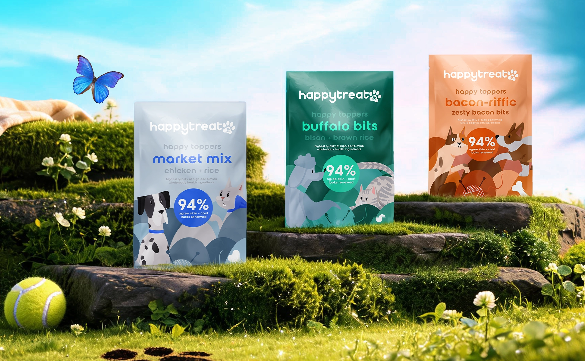
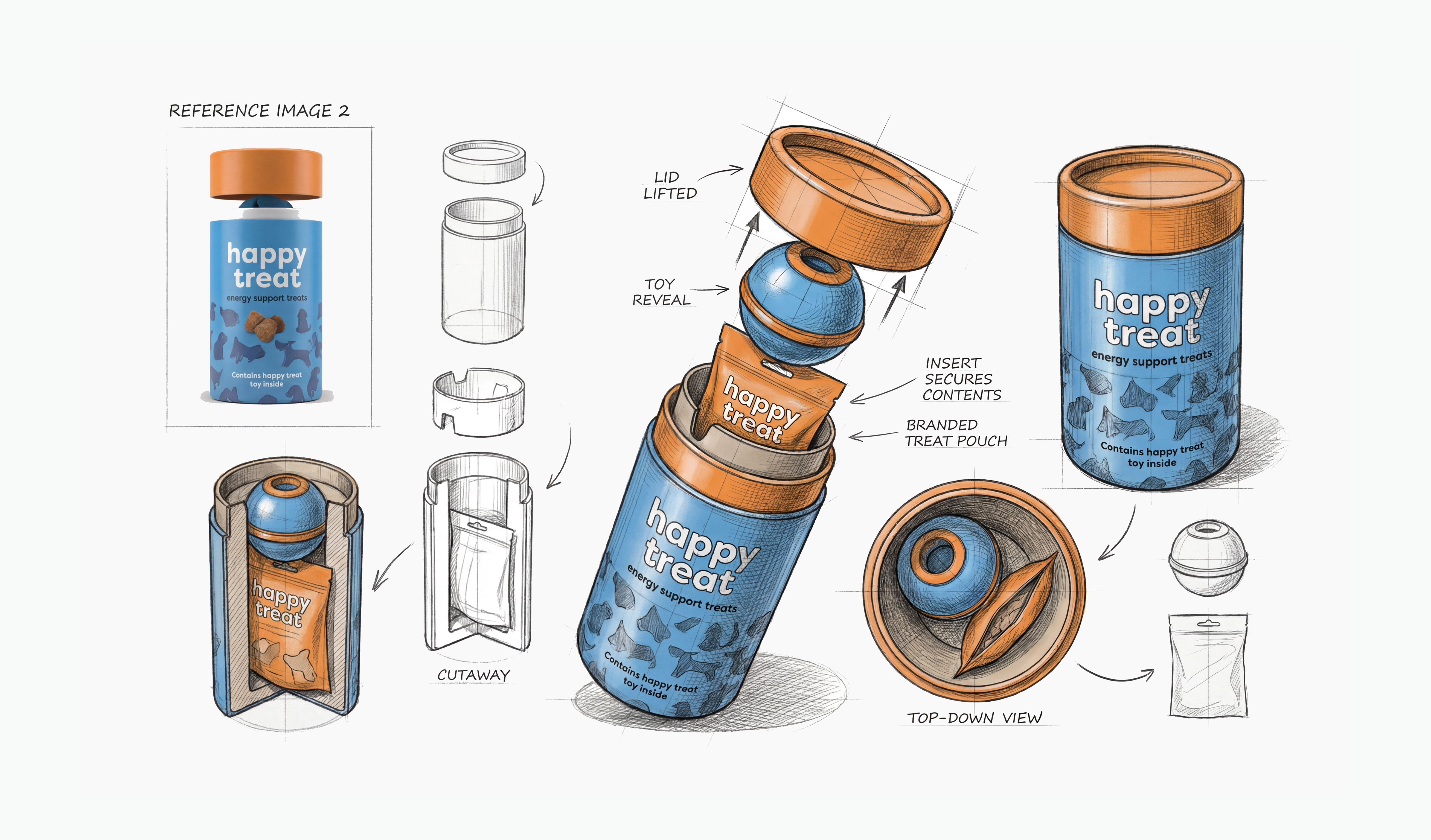
And it was never one product. Two lines — the canister and the Happy Toppers pouches — had to read as family at a glance, stay easy to tell apart, and leave room for whatever comes next without a redesign.
.jpeg)
02
Build the feeling first. Let the system follow.
Every decision traced back to one idea: the burst of delight of opening a Happy Meal, translated for dogs. The logo mark carried that first — friendly, confident, legible small on a pouch or large on a canister lid.
Then I built a system, not a look. A disciplined palette, a clear type hierarchy, and packaging architecture built to stretch across formats while staying one family. The call that mattered most: treating both lines as one system from day one, not two designs that happen to share a logo. Same core identity, color and layout doing the work of separating them on shelf — so a new flavor drops in later without touching the foundation.
Underneath the fun, the work was solving for two readers at once: playful enough to deliver on joy, clean enough that a parent trusts what they're handing their dog. That tension — light on the surface, considered underneath — is what makes a brand-new label feel like it's always belonged.

03
A shelf-ready brand that reads like it's always been there.
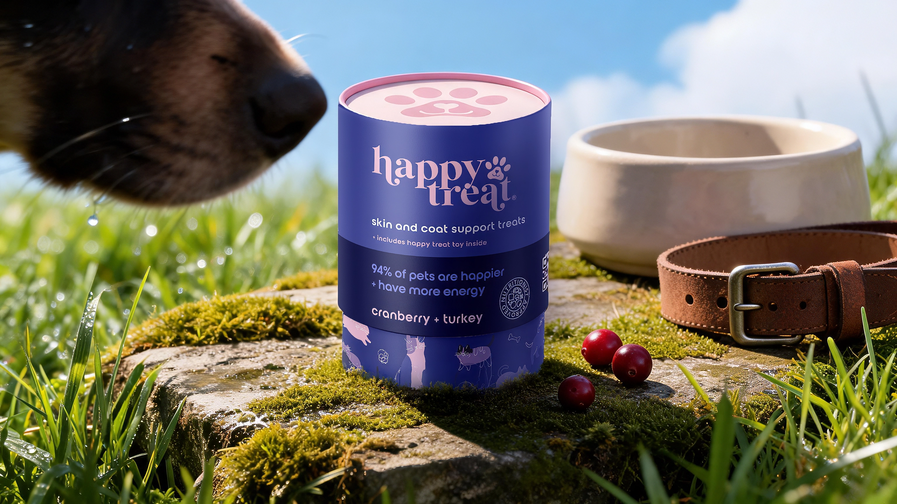
The full identity — logo, system, and packaging — across two product lines, from a single idea to shelf-ready.
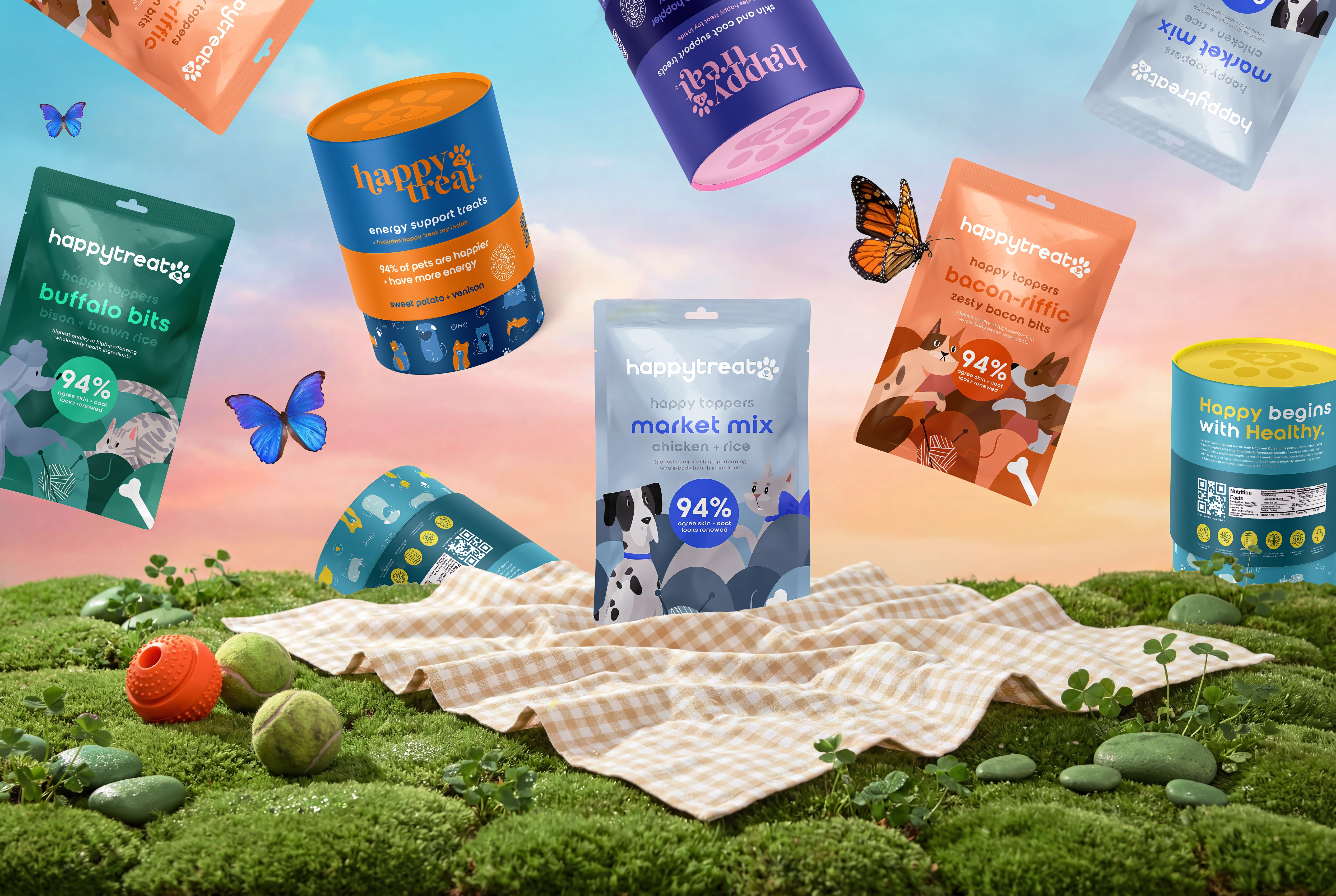
2 | product lines launched under one system; 1 | core idea driving every design decision; 100% | built from scratch, name to shelf; 0 | redesigns needed to add new products
Happy Treat needed to look like it belonged on a shelf next to brands with decades of equity — with zero. The mark, the system, and the packaging all had to carry that weight from day one.
.jpeg)
.jpeg)
.png)